A real audit of mcdonalds.com, run on September 24, 2026, exactly as the tool produced it.
Run one on your siteThe verdict
Visitors stay, and they can read everything.
Biggest win: stop the page from freezing on tap.
Let’s make it better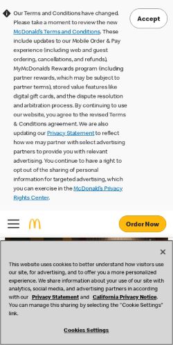
The breakdown
Each score out of 100The to-do list
Start with these.
The biggest improvements come first. Here’s what to change, and why it matters.
Stop the page from freezing on tap
Scripts keep the page busy for 340 ms, so taps and scrolls lag while it loads.
The fixRemove or defer JavaScript. 461 KB of it is never used on this page.
Lighten the page
The page downloads 5.0 MB. On a slow phone connection that is a long wait and real data cost.
The fixImages alone can shed 3.5 MB.
Give the page more breathing room
The page is visually dense. People skim, and a dense screen makes them skip more.
The fixAdd space between sections and shorten the first screen to one message and one action.
A little competition
You lead the group of 5.
tacobell.com is closest, 8 points behind.
| Rank | Website | Visitor score | Speed | Reading | Search | Main content |
|---|---|---|---|---|---|---|
| 01 | mcdonalds.comYou | 93/100 | 85 | 100 | 100 | 2.4 s |
| 02 |  tacobell.com tacobell.com | 85/100 | 97 | 100 | 40 | 1.8 s |
| 03 |  chick-fil-a.com chick-fil-a.com | 81/100 | 46 | 100 | 100 | 8.2 s |
| 04 |  wendys.com wendys.com | 76/100 | 46 | 90 | 92 | 13.2 s |
| 05 |  burgerking.com burgerking.com | 70/100 | 33 | 100 | 75 | 38.1 s |
The wait
Fast enough to keep most people.
Main content in 2.4 s. Bounce risk is up about 21% on a 1 second page, which is within the range Google calls good.
2.4 seconds
Until the main content appears.
A quick first impression.
Where the time goes.
1.2 s
Something appears
The first text or shape shows.
2.4 s
Main content shows
The visitor can finally read or see the point of the page.
11.4 s
Responds to taps
Until now, taps and scrolls may do nothing.
The wait, frame by frame.
Phone capture

0.5 s

0.9 s

1.4 s
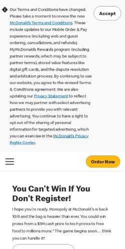
1.9 s
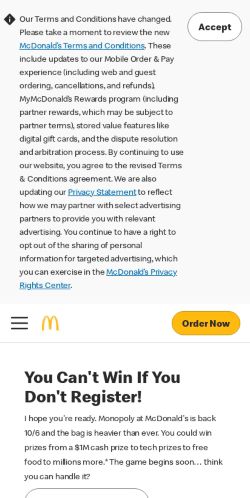
2.3 s
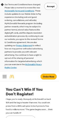
2.8 s
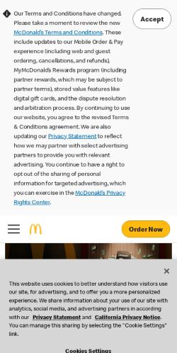
3.3 s
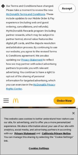
3.7 s
Patience has a limit.
How much likelier a visitor is to leave, compared with a page that shows its main content in 1 second. Dots are Google's measured points for phones; the line joins them.
The actual measurements.
| Moment | Phone |
|---|---|
| Server replies | 170 ms |
| First thing appears | 1.2 s |
| Main content shows | 2.4 s |
| Page responds to taps | 11.4 s |
| Time frozen | 340 ms |
| Layout jumps | 0.07 |
Real Chrome visitors over the last 28 days: main content in 1.4 s for 3 out of 4 people, which Google rates fast.
First glance
Before they read a word.
Your first phone screen, exactly as it loaded. Here's what its space, colour and density say.
Your colour story.
Share of the page
- #fdfefd66%
- #d5d5d63%
- #0906042%
- #2c2b2b2%
- #d801092%
- #eceae82%
- Other23%
- Open space
54%Balanced
Enough open space for the eye to find the headline and the button.
- Density
Dense
Many edges and shapes fight for attention. People skim more and read less.
- Vivid colour
10%Balanced
Vivid colour is used with restraint.
- Mood
Warm
Reds, oranges and yellows lead. Reads as energetic and friendly.
Reading
Every text colour we could measure is readable.
Google measured every piece of text against what sits behind it. All of it clears the 4.5:1 minimum for body text.
Eye comfort
No colour pairs that make the eyes work too hard.
We scanned the page for vivid colours of similar brightness sitting against each other. None of the flat areas do that.
Vivid colour on the page
10%
Restrained. Colour has room to mean something.
Contrast harshness
Comfortable
The main text and background are not at the extreme ends of the scale.
Page weight
A heavy page. Phones on a weak signal feel every byte.
5.0 MB over 82 requests. On a slow 4G signal that is about 24.9 seconds of downloading. 50 requests (1.1 MB) go to other companies' servers.
- Image3.8 MB
- Script941 KB
- Font98 KB
- Stylesheet58 KB
- Other52 KB
- Document37 KB
Images could shed
3.5 MB
Resize to the size shown and save as WebP or AVIF.
Screen blocked by files
1.8 s
Stylesheets and scripts that must finish before anything shows.
Heaviest files
- 1Pub_Monopoly_Post-Launchv3_2336x1040.png3.3 MB
- clientlib-site-global.lc-a6a5997afbd6e08…284 KB
- Bevs_COM_1Pub2:publication-column-mobile176 KB
- js150 KB
- OtAutoBlock.js148 KB
Being found
Google can find and understand this page.
Search checks are the ones that decide whether the page appears in Google and what the listing says. Access checks are what a screen reader or a keyboard user hits.
Search
- Page has a title
- Has a search description
- Google is allowed to index the page
- Page returns a healthy status
- robots.txt is valid
- Canonical address is valid
- Language versions are declared correctly
- Links say where they go
- Links are real links
- Images have descriptions
- Page declares its language
- Secure connection (https)
- No errors behind the scenes
Access
- Every link has a name
- Every button has a name
- Headings are in order
- Buttons and links are big enough to tap
- Fits a phone screen
How this was measured
One lab visit on a phone and a desktop, then a close look at the pixels.
Google PageSpeed loaded the page on a simulated mid-range phone over a slow 4G connection, and again on a desktop (Lighthouse 13.5.0). Speed, search and access checks come from that visit. Text contrast comes from the exact colours the browser painted. Palette, open space, density and vibrating pairs come from scanning the screenshot pixels. The visitor score weighs speed 35%, reading 25%, search 20%, eye comfort 10% and access 10%.